Assignment 2 – Revisions

When I took the photographs for this assignment I had initially decided that I would submit them in black and white as I had completed all the exercises in this unit in monochrome as suggested in the coursebook.  When it came to converting the images I had taken into monochrome, however, I wasn’t happy with how they looked so decided to submit the assignment in colour (full reasoning can be found here).  My tutor mentioned in my feedback that he was surprised that I had chosen to submit in colour as he preferred the black and white. Since submitting this assignment originally I have learned much about photoshop and am better able to tweak contrast and levels and have been able to create much nicer monochrome images from my original colour ones.  Therefore, I have decided to re-submit this assignment in black and white.  Below are both my original submissions and their monochrome counterparts along with other changes I have made based upon my tutor’s feedback.

Single Point Dominating the Frame

Original Image
01 1point c

Revised Image
IMG_1083x c

Two Points

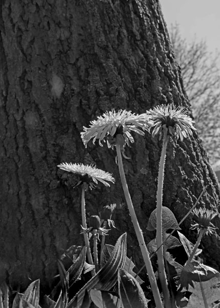
My tutor suggested that my first image did not have much impact and perhaps it would have been better to take the photograph closer to the ground.  I did struggle somewhat with this particular image, finding 2 points in a woodland was difficult and I felt the flowers against the tree worked well.  Once converted to black and white it was clear that it was the colour of the flowers which made them into good points rather than their form.  I decided to replace the image with one which I had taken with 2 points in mind but had not looked good in colour.

Original Image
02 2points 3 cxx xc

Revised Image
IMG_1454x c

Several Points in a Deliberate Shape

This image was another I found difficult and although my tutor rightly suggested that the image would work well as an implied triangle, I liked the way the cones formed the shape and still wanted to use it.  Once the image was converted to black and white though, the cones became lost in the grass and the image did not work at all.  I decided to retake the image but this time from a different angle so that the shape of the cones would make the points rather than the contrast in colours.  In the re-shot image I put the camera low on the ground and the pine cones on a dirt/wooded floor rather than on grass.  I like the chink of light in the background which shows us the shape of a tree rising from the ground and although the triangle created by the cones is a narrow one, it is still a definite shape.

Original Image
IMG_1053c

Revised Image
GK8A0848 xx

A Combination of Horizontal and Vertical Lines

Original Image
04 H&V c

Revised Image
IMG_1124x c

In the second of these images my tutor pointed out that the vertical lines overpowered the horizontal ones somewhat so I decided to crop the image in a lot to remove one of the vertical lines and zoom closer in to the horizontal ones.  When I converted this shot to black and white I increased the contrast as well as lightening the shadows to give the image a little more impact.

Original Image
04 H&V2 c

Revised Image
IMG_1036x c

Diagonals

Original Image
05 Diagonal c

Revised Image
IMG_1293x c

Curves

My tutor thought that this cross-section of a tree trunk lacked imagination, that the straight-on angle it was shot at caused it to loose the impression of the curved shape of the trunk.  I decided to retake the image from a different angle, my tutor suggested down low would work and I chose to shoot from almost side-on so I could still capture some of the tree rings as well as having a curve moving through the photograph.

Original Image
06 Curve c

Revised Image
GK8A0787 x

Distinct, Even if Irregular, Shapes

Original Image
07 Definite Shape 2 c

Revised Image
IMG_1485x c

At Least Two Kinds of Implied Triangle

Triangles were the other photographs I really struggled with in this assignment.  Although many of my images contained triangles of one sort or another, they were always photographs which I had taken with another title in mind.  My tutor felt that the two images I submitted for Triangle were far too obvious and I agree. I have decided to remove the first of these from the assignment entirely, I realise now that not only is it a very obvious triangle but the picture does not really have very much dynamic to it.  The second triangle I have decided to keep as although it is perhaps not as implied as it might be, I really like this shot, even more so since converting it to monochrome.

Original Image
08 Implied Triangle c

Original Image
09 Implied Triangle 2 c

Revised Image
IMG_1109 c

The first of the other 2 triangle images was taken along a woodland path the triangles are mainly created by the pathway and trees growing smaller as you head towards the vanishing point near the centre of the image.  This photograph was, in part, inspired by the Diagonal photograph above but rather than dividing the frame from corner to corner I used the perspective created by the long pathway and wide lens to show the triangles.

Revised Image
GK8A0685 xx

The third triangle image I am submitting is inspired by my original Two Points image though I took my tutor’s advice and got right down on the ground below the flowers.  In this image the triangles are created by the flowers, their stems and also the angle at which the tree trunk moves through the image.

Revised Image
GK8A0883 c

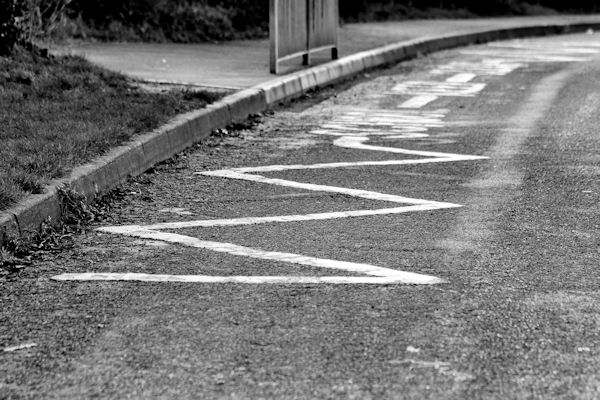
Rhythm My tutor commented that the fence did not stand out from the background particularly well in this image and suggested that if I were to convert to black and white, perhaps I could use a dodge tool on the fence to make the rhythm it creates clearer.  I did this and also tweaked the contrast a little and I think the result works well.

Original Image
10 Rhythm c

Revised Image
IMG_1286x c

Pattern My tutor liked this shot although did suggest I up the contrast levels to bring out the pattern more.

Original Image
11 Pattern c

Revised Image
IMG_1498x c

Assignment 2 – Elements of Design – Tutor Feedback

I was very pleased with the feeback I received from my tutor for assignment 2, I worked very hard on it and it is reassuring to feel I am moving in the right direction with my photography.  I have been given some pointers as to how I could improve this assignment before submitting it for formal assessment and whilst I have decided to move forward with the next section of the course, I am keeping these suggestions in mind and already have an idea or two for re-shooting some of these images.

Below is the feedback I received from my Tutor, Peter Davies.

Overall Comments
Rebecca, you have worked hard on this assignment and I do think you have moved on well from the first assignment in terms of your overall approach to photography. Your thought processes are starting to become more aware of how to use photography as a communicative tool and that comes across in your self-assessment.

The remaining assignments can be interpreted as widely as you see fit, so I will encourage you to think about the creative and imaginative aspects of your work a little more. Yes of course you can through the assignments ticking the required boxes, but there is also the opportunity to develop your own style, take risks and surprise yourself!

Assessment Potential (after Assignment 2)
I understand your aim is to go for the Photography Degree and that you plan to submit your work for assessment at the end of this course. From the work you have shown in this assignment, providing you commit yourself to the course, I believe you have the potential to succeed at assessment. In order to meet all the assessment criteria, there are certain areas you will need to focus on, which I will outline in my feedback.

Feedback On Assignment
I must admit I was a little surprised to see you have submitted the shots as colour images, although I completely understand your reasoning behind this I do prefer the black and white versions because they seem less specific in both location and time. Although black and white photography can be quite strong in a nostalgic sense, it also has an interesting timeless quality. Shooting in black and white rather than colour does have a different working methodology, your reflective notes also mention this so your reasoning in using the colour shots is very good.

The flat perspective of the single point example makes sure all of the attention is on the bird-box, it is a pretty straightforward image that immediately highlights your chosen theme. The two points example lacks any great visual impact, I think a different viewpoint could have helped here. For example, shooting from ground level could have worked better, here you may want to think of your audience a little more – how can you make your images a little more dynamic. The challenge for any photographer is to put their own style into any particular shot however banal the subject matter may be.

The several points image could also have worked as an implied triangle and as with the similarly styled previous shot, it needs a little more impact. The first vertical and horizontal lines example highlights good observation skills but needs a little more thought in terms of composition – the vertical lines form the majority of the image with the horizontals being quite small. The second example works a lot better because the horizontal bench draws the eye to the tree on the left and then back to the bench and the feet. Also it would be a great setting for a portrait shot!

The diagonals example works well, the combination of shadows and the angle of the shot has been well thought through, again you could have used this shot as an implied triangle as there is an abundance of them in the frame!

I think a little more imagination is needed with the curved example, yes we can see the circular rings but the straight on style of the shot seems to loose the natural shape that we know is there. Here you could have concentrated on showing the edge of tree, possibly shooting from underneath and filling the frame with just a small part rather than too much?

Both of the implied triangle images are a little too obvious, I mentioned a couple of your other shots would have worked in this section so you may want to think about a re-edit/shoot.

I can see what you trying to do with the rhythm shot and fences can portray this element quite well (the white picket fence!), although because of the similar colours the fence blends in a little too much, with a black & white version you would possibly ‘dodge’ the fence a little to make it stand out more.
The pattern of the tree bark comes across well although maybe needs a little tweak on the levels to up the contrast of the image.

Suggested Reading/Viewing/Pointers For The Next Assignment
The third assignment is concerned with colour and from a historical perspective it is worth having a look at the work of Ernst Haas, his personal colour work rather than his commercial work is a lot more expressive and worth seeking out. William Eggelston and Stephen Shore were both instrumental in the acceptance of colour photography as a valid art form by the major galleries in the early 1970s.

Take a look at Frank Horvat’s series of colour photographs taken in New York in the 1980s – here he uses colour so well to create the atmosphere and narrative.
http://www.juxtapoz.com/photography/new-york-in-the-80s-by-frank-horvat

Bruno Quinquet also uses colour creatively in his series of anonymous portraits, especially colour accents and similar colours.
https://www.lensculture.com/articles/bruno-quinquet-salaryman-project

I think you may also be interested in the work of Helen Sear, her work is a mix of photography/video/installations with a strong sense of the emotive aspects of colour.
http://www.helensear.com

Your learning log/blog is pretty comprehensive, your research/reflection part is interesting, I would try and bring examples of other photographers’ work into your research if possible as this can only help to inform your own approach to photography.

Assignment 2 – further thoughts

After going through the sequence of photographs I have prepared for this assignment I have come to the conclusion that I am almost there. I am happy with most of my images but there are 2 which I feel are very similar to each other so may not use them both. The first is my new shot for 2 points, whilst I like this better than my original image, of 2 flowers in the bracken, I am still not certain it is strong enough to submit. The 2 points do pop out at me but there is some sky visible behind the larger of the points which perhaps detracts a little from it. The second image is the one I have for shapes, the circular logs. As my 2 points image is also comprised of circular logs I feel the photographs do not really show anything different. I do have another shape image which I could use, that of a roughly heart shaped hole in a log, but I am not really happy with that one as the heart stood out better when the image was taken from an angle which meant it was upside down. I do feel I am running a little low on inspiration now and am trying to think outside the box a little but I do think it is my 2 points image which I will need to change.

I have also made the decision to submit this assignment in colour. I really wanted to continue the monochrome theme through to the assignment but the truth is, the pictures look sharper and more attractive in colour than they did in black and white, despite the fact they are mainly brown and green tones. I also feel that in colour the warm browny tones in particular help pull the images together and give them a springtime and woodland feel which was missing in the monochrome versions.

I think black and white photography is a very particular art and it is one I would like to master but I think perhaps that in order to create a successful series of monochrome images it is best to shoot them in black and white in order to get all the light and tone balances right. I have discovered in the past that not all images convert pleasantly into black and white and often detail is lost, this can sometimes be fixed with photoshop (in fact, I am sure it can always be fixed but my knowledge is limited and self-taught) but I prefer not to adjust my images digitally unless they really need it.

Assignment 2 – Out and About

After some useful feedback from my tutor about my preliminary images I went to Arger Fen, a nearby bluebell wood, for the afternoon to take specific pictures with the elements of design I needed to portray in mind. The main advice my tutor has given is that my images need to be stronger. Although the elements are there, they are not the first thing you see when you look at the photographs. I have decided not to include people in the images for this assignment as when looking through the preliminary images I took, the children are a distraction from the theme and the elements I am trying to portray.

I managed to take lots of photographs and there are several which I feel are good enough to use for my assignment. Most of the ones I had in mind to use have converted well to black and white with only a little adjustment of contrast needed to make them sharper looking.

I have also taken some walks more locally to me and taken my camera along, I am lucky enough to live near some meadows which have small copses of trees around them so they have provided more inspiration and subjects for me to photograph. I was struggling to take a photograph I was happy with for diagonal and for rhythm but I found a spot in nearby Brundon where a road and fence lay alongside some woodland. In the diagonal shot I have taken the trees are not the main focus but they are in the picture and the shadows of their trunks also create further diagonals across the road. The picture I have chosen for rhythm also does not have the trees as the main feature of the image but with the trees behind the fence I think it still fits in well with my theme.

So far I think the rhythm shot has been the most difficult to shoot as it is not always something that occurs naturally and I wanted this series of photographs to have a natural feel about them. The implied triangle photographs have also proved tricky as again, without laying something out deliberately, they are not always easy to find in a woodland. As such I am not completely happy with my triangle photographs, I would have preferred at least one to have been made of larger points but I think they are nice photographs and they do show triangles which are not actual triangles.

Whilst out with my children I did spot 3 birds in a lovely triangular shaped tree, I took a photograph of it and I really like it although the birds are tiny and I am concerned it is a little subtle for an implied triangle. I may submit this one alongside the other 2 images I have though as for me it works and the brief says to submit at least 2 triangles.

With some further feedback from my tutor I went out specifically to work on my pattern and shape photographs. He suggested to me that I might try taking my heart in a log photograph from above rather than from an angle but sadly when I did this it lost much of its shape. The sharpness of the edges was mainly created by shadows and angles and these were lost when I looked directly down. I knew there were some trees near the meadows which had fallen down during the recent storms and had been chopped up so I went with my camera to take some photographs there. I took some photographs of the smaller logs/large branches which were all stacked together as I thought it would work well for distinct shapes. All the circles on the ends of the logs looked good together and I took a couple of shots in a landscape orientation. However, I felt that this made the image look to portray pattern rather than shape as the circles went to the edges of the frame so I turned the camera to vertical position and took a shot where there was sky and trees visible above the logs. I feel this works much better for shape.

I also wanted to work on my photograph for 2 points, I was not really happy with the images I had for this and had in mind using 2 larger objects to balance each other out. I found a large log on its side and balanced a thick branch on another log, got down low to the ground and took some photographs. I tried to balance the photograph by having the large cross-sectioned log taking up most of the image with the second, smaller cross-section up in the corner and to the edge of the frame. I like this image and am much happier with this than I was with the previous photographs taken.

Finally I worked on my pattern image, my tutor suggested getting low down and looking up a tree rather than taking a photograph straight on. I assume this is to better help give the impression that the pattern continues outside of the frame. I took several photographs and am currently trying to decide which of 2 to submit. The first is very close cropped and you can only see bark in the image, the foreground of the frame is in very good focus and it blurs as the eye moves up the image. I feel this helps the eye move through the image and stops it from being too flat. The second is not so close cropped and you can see the bottoms of the branches as you travel up the tree trunk. I suspect the first picture fits the theme of pattern better than the second. Sometimes I find it hard to choose the photograph that works best over the one I feel looks best.

Elements of Design – Initial Planning

For this assignment I need to demonstrate the design techniques I have learned through the last section of the course, I have been given a list of subjects – flowers and plants, landscapes, street details or the raw materials of food – and the option to choose my own subject if I prefer. So far I have worked through this section using black and white photography, as suggested, to help concentrate on the physical elements of design and would like to complete the section by doing this assignment in black and white also.

At the weekend I took my camera to a local bluebell wood thinking that there would be lots of flowers and plants there and I could take some of the photographs for my assignment, or at least get some ideas, but it is still slightly too early for the bluebells to be out and much of the wood was still in a wintery state. There are some gorgeous lines and curves in the woodland though so I decided to experiment using my 50mm prime lens and take some photographs with Woodland in mind for the subject of my assignment.

I really liked some of the photographs I took although I did notice that when converted to black and white, I had to make the contrast stronger on most of the pictures or the trees just blended into each other. I think because it was such a beautiful bright day, the light on the trees and the bright background tend to blend into each other when they do not have colour to separate them from one another. I found some great shapes and patterns and came away with some ideas too.

After going through the images I took and choosing some I would like to use for the assignment I then wrote a rough plan of other images I would need and some I could improve upon. I think some of the photographs would work better taken with flash on a duller day than in natural light on a bright day, particularly the photographs involving points.

img032

Below are some of the images I took which are mentioned in the plan above.

Horizontals and Verticals

Horizontals and Verticals – I’m not sure the lines in this image are strong enough although the child creates a good vertical line and her top is full of horizontals.  The step beneath her and the trees to the side and in front also create horizontal and vertical lines.  I think perhaps this image could be retaken with more of the trees and steps in view to create stronger lines?

Diagonal 2

In this image the angle at which the photograph has been taken means the pathway creates a strong diagonal and there are also diagonal shadows across it.

Diagonal

The diagonals in this picture are created by the brickwork and angle of view, this is a much nicer image in colour, I’m not sure if it works too well in black and white, perhaps due to the bright light.  It now occurs to me that this wall shot straight on would make a good subject for horizontal and vertical lines and the ivy crawling over it would help it keep in the woodland context.

Curve

This path is beautifully but subtley curved.

Curve 2

I like the curved branches around this tree too although wonder if the lines are strong enough to work for my curved image?


Actual Shape

The heart shape on this log is just perfect although I think I may try to take it from a better angle next time I visit the wood as I would prefer the heart to be point down so it is more immediately obvious.

IMG_0631x x - Copy

I liked the diamond shapes created by the branches changing direction on this tree.

Triangle 1

The way the child is sat on the fallen tree helps to create a triangle with the branch running diagonally above her head.  I wonder if I need to digitally add a little more contrast to this image to make the triangle more obvious.

Triangle 2

Another triangle here created by the tree.  I did also take this image vertically but I prefer the horizontal one as it puts the tree in its context and, in my view, makes the triangular shape of it stand out.

Rhythm

The stripes across this Silver Birch create an interesting rhythm which leads you up and down the image rather than across it.

Pattern

This interesting tree trunk creates a great pattern which works particularly well in black and white.


Another idea I had for this assignment is Musical Inspiration, I have taken no photographs for this yet but I have drawn up a plan of what I could do.  I am not sure if this will make an interesting and varied enough theme but it may work better in black and white than the woodland theme I had in mind seems to.

img033

The other theme I am considering is the Street Details theme mentioned in the coursebook as I think this will work particularly well as a black and white theme.

Rhythms and Patterns

For this exercise I was asked to produce at least 2 photographs conveying rhythm and pattern. Rhythms and patterns are a very specific design element or rather, are made up of lots of design elements massed together. To make a rhythm or pattern work there must be some kind of order in the way they are grouped or arranged. Repetition is important too and this is one of the things that makes a rhythm or pattern interesting to the eye.

The difference between rhythm and pattern took some thinking about for me and in some cases there seems to be a fine line between what is rhythm and what is pattern. To put it simply, an photograph portraying rhythm will draw you through the frame and a pattern is much more static. In the coursebook it states “There is some connection here with one of the basic pleasures in music: there is a visual beat to pictures containing a repetitive theme, just as there is a musical beat.” I found this a very useful analogy, particularly when looking for rhythms to photograph, as I could imagine my eye bouncing along through an image in the same way it would if I were following a musical score or bobbing in time with a song.

Rhythm

IMG_0871x x

As music was mentioned first I took a photograph with the camera aiming straight downwards onto a section of this score of music (JS Bach’s Mass in B Minor) making sure to take in the treble clefs at the beginnings of the lines of music.  Although this is not a dynamic image it does demonstrate rhythm in the simplest of terms.

IMG_0850x x

For this image I decided to take a photograph of my washing on the line, not the most interesting of subjects but the angle the picture has been taken at helps make it more attractive.  The frame has been divided into 2 triangles which makes it more interesting and the lines of the clouds help draw the eye into the point of the ‘top’ triangle.  The rhythm in this photograph is provided by the pegs on the line and the gaps between the clothing.

IMG_0872x x

The rhythm in this photograph is provided by the ironwork fence, the brickwork and the shadows on the brickwork.  I tried taking this photograph straight on but the sense of movement through the image was much stronger in this shot because of the diagonals created by the angle of view.

IMG_0882x x

This image is of an unplastered block in an unfinished part of my house.  I love the wavy sets of parallel lines and although to look at they make a very pleasing pattern, I feel that the gaps between the sets of lines give this photograph a rhythm which will lead the eye all over the frame.  The way the lines are curved also gives a good sense of movement.

IMG_0866x x

In this photograph it is the repetitive placement of the fence panel edges which takes you through the photograph.  The small dots created by the nails punctuate the wood and tell the eye at which level to travel through this otherwise very simple and samey image. This is an image where I feel it almost falls into the pattern category as the pattern of the wood is really the main feature but the regular edges of the panels and the small nails do bounce my eye through the image and this is a feature of rhythms.

Pattern

IMG_0808x x

This image is of some paving cobbles leading down to a ford across a road.  I took this photograph with pattern in mind but I think it is very borderline whether this image falls into the rhythm or the pattern category.  The close framed nature of the image certainly suggests that the pattern carries on beyond the edges of the frame and although there are irregularities, it is a simple and repeated arrangement that I have captured and this should put it in the pattern category.  However, the angle of view has the cobbles slanting away into the distance and the curve on the road and the shadows leading from the side of the image upwards do give the image a sense of rhythm too.  Had I taken this image from directly above there would be no question in my mind that it would be a pattern but at this angle I am not completely sure.  Photography and other arts are a very subjective thing though so I am certain that different people will view it differently and I like the photograph so don’t really see it as a problem that it has a mixture of both rhythm and pattern.

IMG_0862x x

This image is of some stone-filled concrete and was taken directly from above, whilst there is no regularity in the grouping of the stones at all it is still a pattern.  The way that the pattern reaches the edge of the frame, and the fact that some of the stones are cut off by the frame, really gives the impression that the image is part of something larger and the stones continue outside of the frame.

IMG_0869x xc

This image is taken from above and is of my doormat.  I really like the repeating pattern captured in this photograph and by converting it to black and white, the pattern stands out even more.  For me, the slight shadow in the bottom right hand corner draws me into the image and then I can follow the maze of lines across the frame as I choose.

IMG_0881x x

This photograph is of a chunky knitted scarf, I was very close to the fabric and framed it tightly so that the pattern is the focus of the image.  There are also faint diagonals in evidence which give you a suggestion that what you are looking at is possibly round although in fact it is just the way the scarf is hanging.

IMG_0878x x

This photograph is of another scarf, this time one woven in such a way that shadow and light are what bring out the pattern, and is another image where I think the lines between rhythm and pattern are blurred.  I think the 2 different tones of fabric and the way the folds of the scarf hang almost make the pattern seem to march across the frame and this makes it seem almost rhythmical.  The tight framing of the photograph and the patterns within it, however, fit more with the brief for a pattern.

Rhythms and patterns are everywhere, sometimes they are immediately obvious and other times the framing of the photograph is what will make them appear.  In working through this section of the course I now see, more than ever, how important perspective is when composing an image as it can change the shapes and lines within a photograph and even its meaning.

On a lighter note, I don’t think I’ll forget the spelling of ‘rhythm’ again in a hurry after writing it so many times today!

Rectangles and Circles

The next section in the coursebook discusses regtangles and circles and although no exercise has been set I have looked through my own photographs to find images with strong rectangles or circles in them to help demonstrate how they work within an image.

Rectangles in photographs can seem very basic because of the way they relate to the shape of the photograph frame, as most images tend to be rectangular themselves they can also be naturally divided by other lines into smaller rectangles.  Because they are such a regular shape they are much more often man made than natural.  You also have to be very careful when photographing a rectangle to make sure you are exactly face on to it, perspective can cause rectangles captured even slightly to the side to become trapezoids.

Circles are much more difficult to find in photographs than triangles and even rectangles and are mostly circular objects.  Circles are a very precise shape though and will draw your eye into them more than any other shape will.


IMG_0133 xIMG_0133 c

In this image I was stood at such an angle that this flag creates almost an exact rectangle and by placing it in the centre of the frame I have made it the only real design element in the image, although the cloud and sun do add interest into the background.


IMG_0174 xIMG_0174 c

In this image the rectangles are created by the ends of the bricks and they make a repeated pattern.  Because only a little of the last brick on the right is showing the impression is given that the pattern continues outside of the frame.

IMG_0501 xIMG_0501 c

This image is made up of many shapes but I have highlighted the rectangles and the circle which immediately draw my attention.  Another obvious shape in this image is the triangle created by the roof of the building.  In the foreground of the photograph there are some allotment beds but because of the angle of the camera, perspective makes these rectangular shapes into trapezoids.

IMG_0651x xIMG_0651x c

This image is full of circles, some of them are slightly irregular and none of them are quite perfect but they are round enough to give the impression of many circles.

IMG_0590x xIMG_0590x c

This image here is made up of many rectangles but the main focus of the image is the plant growing out from between the concrete structures.  The plant creates a circle in the image which draws the eye and then the pattern of rectangles carries it through the image.  Although this is again not a perfect circle, the shape of the plant implies one.

IMG_0534 cIMG_0534 cx

For this last image I wanted to take a photograph of this circular paving stone as I thought it would be a good demonstration of a circle and the flowers around it look pretty but what I actually ended up with was a picture of a very nice implied triangle!  I included this image to demonstrate that when photographing a shape it is important to take notice of the compositional elements of its surroundings before taking the photograph.  In the previous photograph of the plant coming through the concrete structure, a circle is far more in evidence than it is in this picture of an actual circle.


Real and Implied Triangles

For this exercise I had to produce 2 sets of triangular compositions in photographs, one set using ‘real’ triangles and the other using ‘implied’ triangles.  Triangles are perhaps the most frequently used shape in photographs, not only are they the simplest shape – being made of 3 points or lines – but they are also the most useful as they can create movement and dynamic in an image in much the same way diagonals and curves do.  In fact, when you look at it, a triangle is made up of at least one diagonal.


Real Triangles

IMG_0815x xIMG_0815x xc

First I had to find a subject which is itself triangular.  This could be a triangle or a detail of something larger.  I chose to take a photograph of one of the porch supports outside my house.  With the triangle in the top corner of the photograph it gives it a look of stability without being too static.  It contrasts with the tangle of plants behind it and gives them context.  I have marked the triangle in red but although I was not asked to look for implied triangles in this photograph, I have marked in green where a second triangle is implied.  Because the red triangle is ‘real’ it is more prominent in the picture and the second, green, one is not immediately obvious.

IMG_0846 x IMG_0846 xc

For the second image I had to make a triangle by perspective which converges towards the top of the frame.  To do this I crouched down low to take a photograph of a bench in my garden, the lower I crouched and the closer to the wooden slats I was, the more they seem to close in on each other in the distance.  Although the top of the triangle is not in the photograph you can still see the triangular shape made by the slats converging in the distance and it suggests the point of the triangle is not far out of the edge of the frame.

IMG_0821x xIMG_0821x xc

For the third photograph I had to take a picture, using perspective again, to make a triangle which converges at the bottom of the photograph.  I took a photograph of this vase of sticks but I stood above them so that the way the sticks come together in the vase is exaggerated to make an inverted triangle.


Implied Triangles

IMG_0833x xIMG_0833x xc

For the first of the implied triangle images I was asked to make an arrangement of 5-6 items to form a triangle with the apex at the top.  I used these polished stones and laid them out on a paving slab.  Although they do not make a particularly interesting still life, they do demonstrate the way in which points can make up a shape.

IMG_0834x xIMG_0834x xc

For the next image I was asked to use 5-6 shapes to create a triangle which points downwards.  By moving just 3 of the stones used in the previous photograph, as indicated by the green arrows, a new triangle is produced with its point at the bottom of the photograph.

IMG_6086xx xIMG_6086xx xc

For the final image I was asked to arrange 3 people in a group picture in such a way that either their faces or the lines of their bodies make a triangle.  In this photograph my children were jumping off of some concrete blocks at the beach.  As my daughter is smaller I asked her to stand in the middle, when they jumped her bigger brothers jumped higher than she and so between them they create a triangle.  Although the angle of their bodies is vertical, the positions of their faces create a clear triangle.


Triangles do seem to be a very common element in photographs and where you find one triangle you will usually see others which balance it out, as in the first photograph I took here of the porch.  Sometimes triangular details are captured and sometimes triangles can be created with other lines in a photograph.  It is not even always necessary for there to be 3 lines on a triangle in a photograph as the edges of the frame can create either 1 or 2 of the lines needed to complete the shape.

Perspective can also be used to create triangles, even when photographing parallel lines.  By changing the angle at which you take the photograph it changes the way the lines appear in the image.  By crouching low and close to long parallels a triangle can be created as the lines converge in the distance, the same effect will also be evident when taking a picture of a long straight road or path.  Creating a triangle with a point towards the bottom of the frame is also a matter of where you stand to take the photograph and also, I imagine, what lens you would use.  I think it is easier to create an upwards pointing triangle.

Interestingly, when I have looked through my own photographs and found those I particularly like of people, they are nearly always creating triangular shapes between them whenever there is more than one person in shot.  Even when you can’t immediately see them, triangles work like diagonals to help create movement and balance in the photographs and are a very useful tool in composition.

Implied Lines

Implied lines are very interesting and can be used both to join elements of a photograph together and also to encourage another person to view your photographs in the way you want them to.  Sometimes they can be seen, as in a row of points, but other times they will be imagined, as in following someone’s eyeline or an extension of movement created by something moving across the photograph.

For this exercise I have to start by looking at 2 photographs in my coursebook and looking for the implied lines.  In the first image, a matador and bull, the lines I see are curved and give the impression of the man and the beast circling each other.  You can also see from the direction of the matador’s head that he is looking down at the bull whereas the bull has his head down as he tries to round the man and his flowing cape.  In the second image there is a man and a pair of horses, they are almost in sillouhette as the sun is low and the background is bright.  Again there are curved lines implied in this photograph and the horses appear to be circling around the man, the angle of their bodies shows it but so does the way their heads are turned and the fact the second horse, which is slightly behind the first, is looking towards the first enhances this.  You also get a sense of movement from the man as he appears to be walking into the picture, one leg is a little behind him and he has an arm in front of him which help give this impression.  Whether your eye is first drawn to the man or the horses in the picture – in my case it was the horses – there is an implied diagonal between them so one leads you naturally to the other.

Next I was asked to find 3 photographs of my own of which to analyse in the same way.

IMG_2435x x IMG_2435x c

In this photograph there are several lines which lead your eye around the picture both implied and actual.  When I look at the image my eye goes straight to my daughter in the foreground as she stands upon a wooden sleeper, her face looks towards the camera and towards her outstretched hand and that takes me down to the bottom of the frame.  The line of intermittent wooden sleepers then takes me up to the top corner of the frame where I can see a couple walking in the distance.  As my eye travels up the line of sleepers I pass my son who is leaping across the gaps between.  One of his outstretched arms takes me to the top corner whilst the other leads me along the horizon to the other side of the frame.  I can then follow his eyeline downwards towards the sleepers again and then back to my daughter.  There are several stories here, the girl posing for a photograph, the leaping boy photobombing his sister and the couple taking a walk.  The various lines in this image seem to lead you around it in more than one way so you can move around it in different ways noticing the different elements in it.

IMG_6102x xIMG_6102x c

In this image my son has thrown a handful of sand into the air and is watching it .  There is a line going from his eye to his hand which leads me to the sand in the air, it does not lead me immediately downwards but the way he his holding his arm suggests he has just raised it and makes me look downwards to the edge of the sea and then to follow the line of sand back upwards.  There is an implied circle in the centre of this image which is strengthened by the position of the boy who is crouching, creating a curved shape.  Had he been standing I don’t think this image would have worked so well.  There are also other lines in this image, one created by the sea and another by some clumps of seaweed in the distance.  These create a lovely curve which helps to draw me further into the distance of the photograph.

P1190745x xP1190745x c

In this image my boys are examining and comparing some crabs they have caught by the sea.  When I look at this image my eye goes straight to the boys’ faces and then follows their eyeline to the crabs.  The lines of sight go diagonally towards their hands and almost converge as they reach the two little crabs.  There is also a curved line from the lower crab to the one higher in the photograph which is created by the curve of my son’s fingers as he holds the tiny creature on his palm.  There are other lines in this photograph created by the groynes and the shoreline but they are secondary in the composition to the implied lines.  Although they add a little interest and context to the background of the image, I feel the image would still be good without them.

For the last part of this exercise I had to plan and take two photographs using an eyeline and the extension of a line or lines that point.  I don’t find planning photographs easy, generally when I go somewhere I only have a vague idea of what I am going to capture and I see what inspires me as I go along so this part of the exercise was difficult for me.

At the weekend we went out for a walk across the local meadows and along the old railway line.  I took my camera, as I usually do, and looked out for instances where I could take images with implied lines.

IMG_0412x xIMG_0412x c

For the first image I decided to take an image using an implied line created by eyeline, my daughter was walking behind everyone else as she was struggling a little with the flooded meadow and was looking ahead to where the others were.  I fell back a little so I could capture her from the side as she was looking forward.  I placed her to the left of the frame and took the photograph.  The implied line follows where she is looking and so draws the eye through the image, her raised foot and outstretched arms also give her a sense of movement which also helps to carry the viewer through the photograph.

IMG_0499x xIMG_0499x xc

For the second image I wanted to take a photograph showing lines that point, as part of our walk we were going along an old railway trail and I knew that the path and the trees above it would create a kind of tunnel.  My children were running along one behind the other and I took this photograph of them.  The lines of the pathway all narrow into the background creating lines that point into the distance (marked in green) but there are implied lines between and through the children which also lead you into the background of the photograph (marked in red).

This exercise was an interesting one and it demonstrates that there are lines everywhere whether you see them initially or not.  How these lines are positioned in a photograph can decide whether a composition works or not and are a useful tool for guiding the viewer through an image.

Curves

For this exercise on curves it was explained that, like diagonals, curves gave a sense of movement and direction and because they pull the eye in they are a useful element in planned composition.  I was asked to look for and take four photographs using curves to emphasise movement and direction.  Bearing this in mind I tried to stay away from taking photographs of round things as, although they are curved, they do not always give a sense of movement.

IMG_9550x x

For this first image I stood to the side of a curved footbridge so that the bridge started outside the edges of the frame and curved inwards to the far side.  Both the upper and lower curves of the bridge are in the picture and due to the perspective it is taken at there is a real feeling of direction in the image, you can see that the bridge is stretching away into the photograph.  Had this image been taken side on then the curves of the bridge would still have been in evidence but the sense of movement would not be present.

IMG_9615x x

I took this photograph low to the ground so that the slight curve of the road was enhanced.  The angle I have taken the picture at also makes the curve seem greater than it is.  The way that the curve stretches from the bottom side of the image to the opposite top corner enables you to imagine the road continuing out side both side edges of the frame.  In essence it is doing the same job as a diagonal line would do but as the curve is softer than a straight diagonal would be, the image flows better.

IMG_0513x x

I love this curvy fence, it would still be very pretty if captured at an angle which directly faced it but in order to give a sense of movement I took the photograph from a more acute angle.  I bobbed down slightly to bring the fence higher in the frame.  Curves like this would work very well as either a horizon or a partial frame if the subject behind was interesting enough but from this angle they lead you through the frame from one side to the other.

IMG_9640x x

This image uses the curves of a waterway to lead you into and through the photograph.  The image is also divided into implied thirds by the path of the water as it winds from the bottom of the frame, across, back and out the side.  Although this is a simple image I still find it pleasing to look at, perhaps because of the implied divisions, and it demonstrates the way a curved line can draw you through a photograph.

Although is says in the coursebook that curves can be considered as a kind of diagonal line I feel they are much softer and create a more gentle line in a photograph.